Creating a clean website isn't just about minimalism or following the latest design trends. It's about crafting an experience that feels intentional and refined while effectively communicating your message. A clean website combines thoughtful spacing, strategic design choices, and careful attention to detail.
Looking for inspiration for your next website project? We've gathered some of the best clean website examples that showcase how to balance simplicity with impact.
The best examples of clean website design
A quick note before we dive into the examples...
You'll notice that many (not all) of the websites in this list were designed by us. This isn't to trick you into working with us, it's because our approach to clean website design goes beyond trends.
As a specialist B2B web design agency, when we create "clean" websites, we integrate strategic thinking and user experience best practices into every design decision. We don't strip back designs just to achieve a minimal look; we carefully consider each element to ensure it serves a purpose and enhances the user experience. So while these websites showcase clean design, they also demonstrate how to make those design choices work strategically for your business.
1. Viedoc
In the complex world of clinical trial technology, Viedoc's website stands out with its refreshingly simple approach. The minimalistic design perfectly mirrors their promise of simple clinical trial technology.
The site masterfully employs light gradients and generous white space, creating a sense of openness that makes complex information more digestible. What's particularly clever is the approach to displaying software UI screenshots, instead of harsh black device frames, we opted for fresh, modern containers that feel light and inviting.
The navigation is beautifully simple, proving you don't need elaborate menus to present information effectively. Their restrained colour palette of black and white, accented with subtle purple gradients, puts the emphasis exactly where it should be, on clean, clear typography.
2. C.H.I Overhead Doors
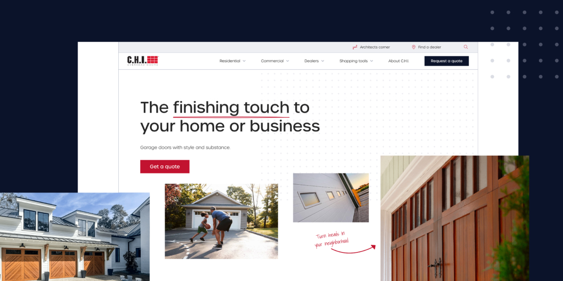
Who says industrial manufacturers can't have clean websites? C.H.I Overhead Doors proves that clean design works for any industry. The website takes what could be a visually cluttered product category and transforms it into an elegant, polished experience.
High-end photography takes centre stage, but it's the thoughtful spacing that makes this site shine. Images are arranged in varying combinations to create visual interest without overwhelming the visitor. The typography is particularly well-executed, creating clear hierarchies that make content scanning effortless.
Perhaps most impressive is the mega navigation. What could easily become a cluttered mess is instead a masterclass in organisation, proving that even complex site structures can maintain a clean, intuitive feel.
3. Hajster
Sometimes the product should do the talking, and Hajster's website understands this perfectly. Their clean, stylish design puts their products front and centre while maintaining an uncluttered aesthetic that enhances rather than competes with their offerings.
There's also a great, subtle approach to animation. Product views shift and change without being intrusive, giving visitors a comprehensive look at different parts without overwhelming them. It's a perfect example of how minimalistic design doesn't mean sacrificing functionality, every necessary element for buyers is present, just presented in a beautifully streamlined way.
4. Datel
Datel's website is a masterpiece of modern, clean design. The homepage immediately sets the tone with generous white space, crystal-clear typography, and bespoke animated illustrations that add personality without cluttering the experience.
The colour palette shows restraint, using colour strategically to highlight key messages and conversion points. This creates clear visual pathways through the content, guiding visitors naturally to important information and calls-to-action.
The mega menu deserves special mention. It presents a wealth of information in a digestible, well-organised format that never feels overwhelming. Combined with the high-end, professionally colour-graded imagery, it creates a premium feel while maintaining perfect clarity.
5. Ramp
Ramp's website demonstrates how to make a bold statement while maintaining clean design principles. Their hero section features striking images that capture attention, but as you scroll, the design becomes more subdued, shifting to a monochromatic palette that lets the content speak for itself.
Subtle movements help explain product features without disrupting the clean aesthetic. Their product screenshots are elegantly presented in modern device frames, with specific features highlighted and seamlessly integrated with branded elements.
6. INSHUR
INSHUR's website proves that clean design can still be creative and industry-specific. Their use of high-end photography is cleverly masked within transport-themed elements, like using rear-view mirror shapes as image frames, creating an elegant connection to their insurance offering without compromising the clean aesthetic.
The navigation features a sophisticated opacity effect that creates a glass-like appearance, adding a contemporary layer to the user experience. Even in their business-focused sections, which switch to dark mode, the site maintains its clean aesthetic while adapting to different user preferences.
7. CapEQ
CapEQ's website demonstrates the perfect balance between visual impact and clean design.
Colour and imagery are used with careful consideration, establishing a calm and clean design that reflects their measured approach to business. The clear, bold headings make content scanning effortless, while the strategic use of photography adds personality without overwhelming the design.
What's particularly effective is their simple navigation and site architecture. By avoiding choice paralysis, they've created an experience that makes it easy for visitors to find exactly what they're looking for.
8. Velux
Velux has created an experience that perfectly embodies its product's core benefit – bringing light and clarity to spaces.
While clean websites typically shy away from abundant visuals, Velux demonstrates how high-end photography and background videos can work within a clean design when paired with ample white space and well-sized typography.
Their navigation solution is particularly clever. Core pages are presented in a familiar horizontal menu, while additional content is tucked away in a burger menu. This maintains UX best practices while preserving the clean aesthetic.
9. FT Technologies
FT Technologies proves that technical products don't need technically complex websites. The clean design approach begins with an impactful homepage video that sets the tone for the entire experience.
The generous use of white space throughout the site creates breathing room for complex technical information. Product pages are particularly well-executed, using bold typography to highlight core features alongside simple yet effective product imagery that clearly communicates both form and function.
The simple navigation ensures visitors can quickly find the technical information they need without getting lost in unnecessary complexity.
10. Overpass
Overpass shows how to incorporate personality into clean design. Their website immediately catches the eye with sleek imagery and strategic colour blocking.
White space is used as a powerful tool to direct attention to important content and imagery. The strong typography in headings works with carefully chosen animations to guide visitors through the experience. Their integration of brand elements geometric shapes and micro-animations add visual interest while reinforcing brand identity without cluttering the design.
11. Equiem
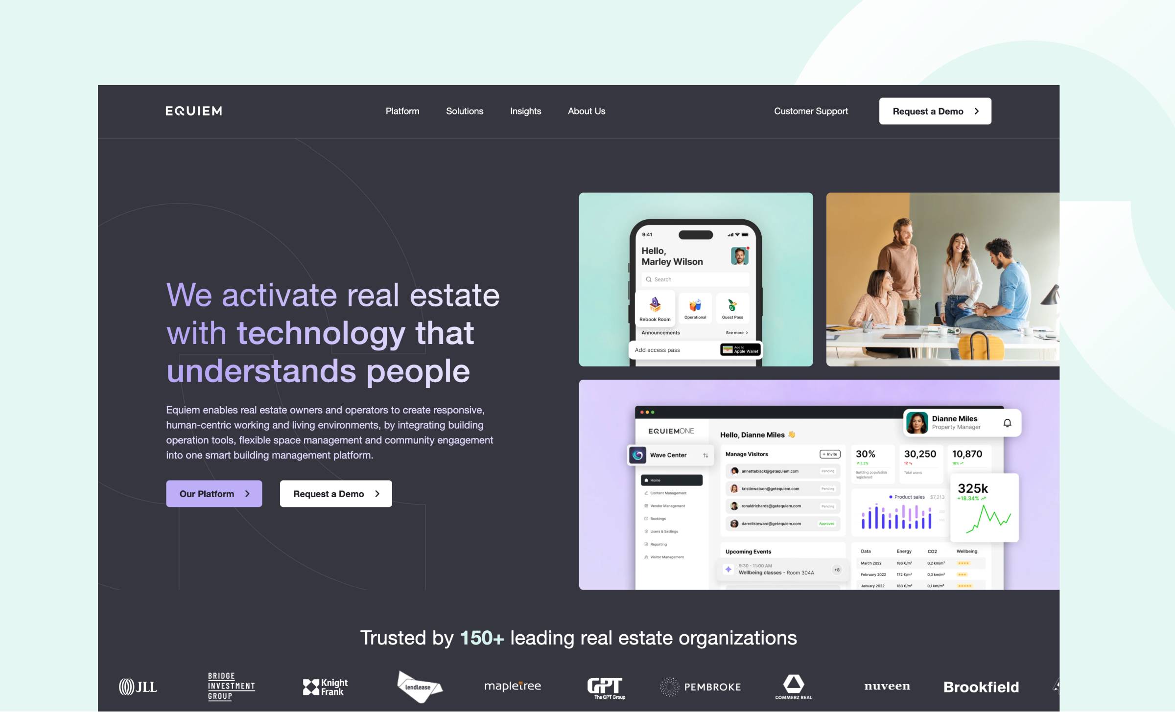
Equiem's website is a testament to how clean design can effectively communicate SaaS tech. The design, content, and visuals work in harmony to convey their positioning with remarkable clarity.
The use of subtle background colours works brilliantly with clean, bold typography to enhance readability. Content is given room to breathe, creating a layout that feels spacious and considered. Video elements are particularly well-handled, placed strategically so they blend seamlessly into the website experience while maintaining appropriate proportions.
12. Firstpoint Logistics
Firstpoint Logistics shows how to bring energy to clean design through thoughtful use of colour. Their website combines fresh white space with vibrant gradients, creating an experience that feels both professional and contemporary.
The clean colour palette is complemented by subtle brand elements and creative uses of their logo, but what's impressive is how they maintain plenty of white space throughout. This creates a perfect balance between brand expression and clean design principles.
What makes an effective clean website design?
Creating a truly effective clean website requires more than just removing elements. Here's what makes these examples stand out.
Minimalistic layout with purpose
Clean design isn't about stripping away elements arbitrarily, it's about being intentional with every component. The most effective clean websites maintain all necessary functionality while presenting it in a streamlined, thoughtful way.
Strategic use of white space
Modern websites embrace breathing room, but not just for aesthetic reasons. Proper spacing creates visual hierarchy and improves readability, making complex information more digestible. It's about using space as a design element in its own right.
Thoughtful typography
Typography plays a crucial role in clean design. The best examples combine readable fonts in interesting ways, creating clear hierarchies while maintaining perfect legibility. It's about finding the sweet spot between visual interest and practical function.
Intuitive navigation
Clean design should never compromise usability. The most effective clean websites feature navigation that's both visually minimal and highly functional, helping visitors find what they need without overwhelming them with options.
Intelligent colour usage
Colour in clean design is about quality over quantity. A refined palette, used strategically to guide users and highlight key elements, is more effective than an abundance of colours competing for attention.
Creating your clean website
While these examples showcase different approaches to clean design, they all share a commitment to purposeful simplicity. The key is understanding that clean design isn't about limitation – it's about making intentional choices that enhance both aesthetics and functionality.


