For a B2B website to effectively drive business growth, it needs to be more than an online brochure, it needs to help buyers perform research and convert visitors into leads. The user experience, design, copy, performance, and structure of your site all play their part in achieving this... as does the CMS that acts as the foundation to your website.
WIhen it comes to creating your B2B website, HubSpot Content Hub is hard to beat. It takes care of the technical stuff, such as managing complex server infrastructure and software patches, and provides a platform that is reliable, secure, and fast.
With in-built features, such as smart content, A/B testing, SEO tools, landing pages, and the option to fully integrate your CRM and marketing automation software, it's a great foundation on which to build a buyer-centric website that provides a frictionless user experience.
Examples of websites built with HubSpot
HubSpot gives businesses the flexibility to build their website from scratch, or use pre-built themes and templates to bring their vision to life. As the #1 HubSpot Website Agency, we don't use templates or tweak themes. We specialise in designing bespoke B2B websites on the HubSpot CMS - and have built over 130 of them!
To inspire you, here are 25 examples of bespoke, tailored websites that we've built on HubSpot that support B2B demand generation and give businesses a market-leading presence while keeping user experience at the heart.
Inshur
Inshur's website aligns design elements with their core business focus. The automotive-themed image masks and shapes create a cohesive visual identity that perfectly reflects their auto insurance offering.
The website's architecture demonstrates sophisticated user journey planning, with distinct B2C and B2B sections that are easily accessible through the navigation. These areas are visually differentiated through strategic colour application, ensuring clarity for different audience segments.
What sets this website apart is the attention to content presentation. Every element has been carefully considered. From typography and spacing to colour choices and module design, it ensures information remains easily digestible throughout the user journey. The result is a website that not only strengthens Inshur's brand presence but creates an optimised path to conversion.
Algorand
Algorand's website exemplifies excellence in brand application, delivering a unified message across diverse user groups through consistent design elements.
The homepage immediately captures attention with an engaging video. A particularly innovative feature is the rotating banner displaying real-time data through API integration, ensuring visitors always see current, accurate figures.
The website excels in content accessibility, offering information in various formats while maintaining an intuitive navigation structure that guides visitors effortlessly to their desired content. A standout feature is the implementation of light and dark mode switching - a thoughtful addition that caters specifically to developers who often prefer darker interfaces for their work.
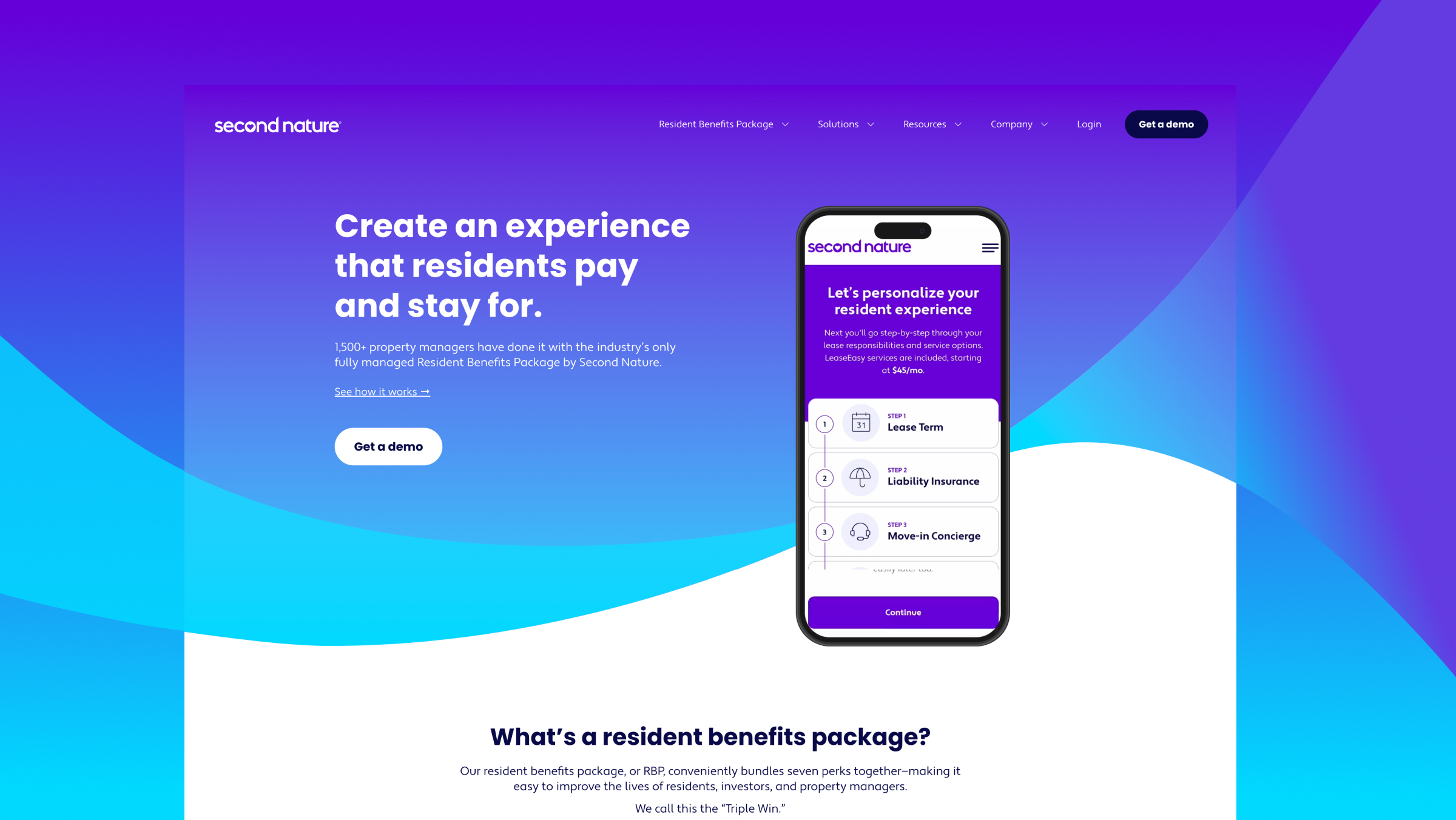
Second Nature
Second Nature's website reflects their commitment to enhancing the lives of residents. The homepage has an engaging, looping video, that gives a quick insight into what the software looks like. The entire website has a vibrant, positive design, blending product imagery and relatable stock photos, which perfectly captures the essence of their target audience.
Offering a seamless and intuitive user experience, it directs visitors to valuable informational content and is optimised for demo requests.
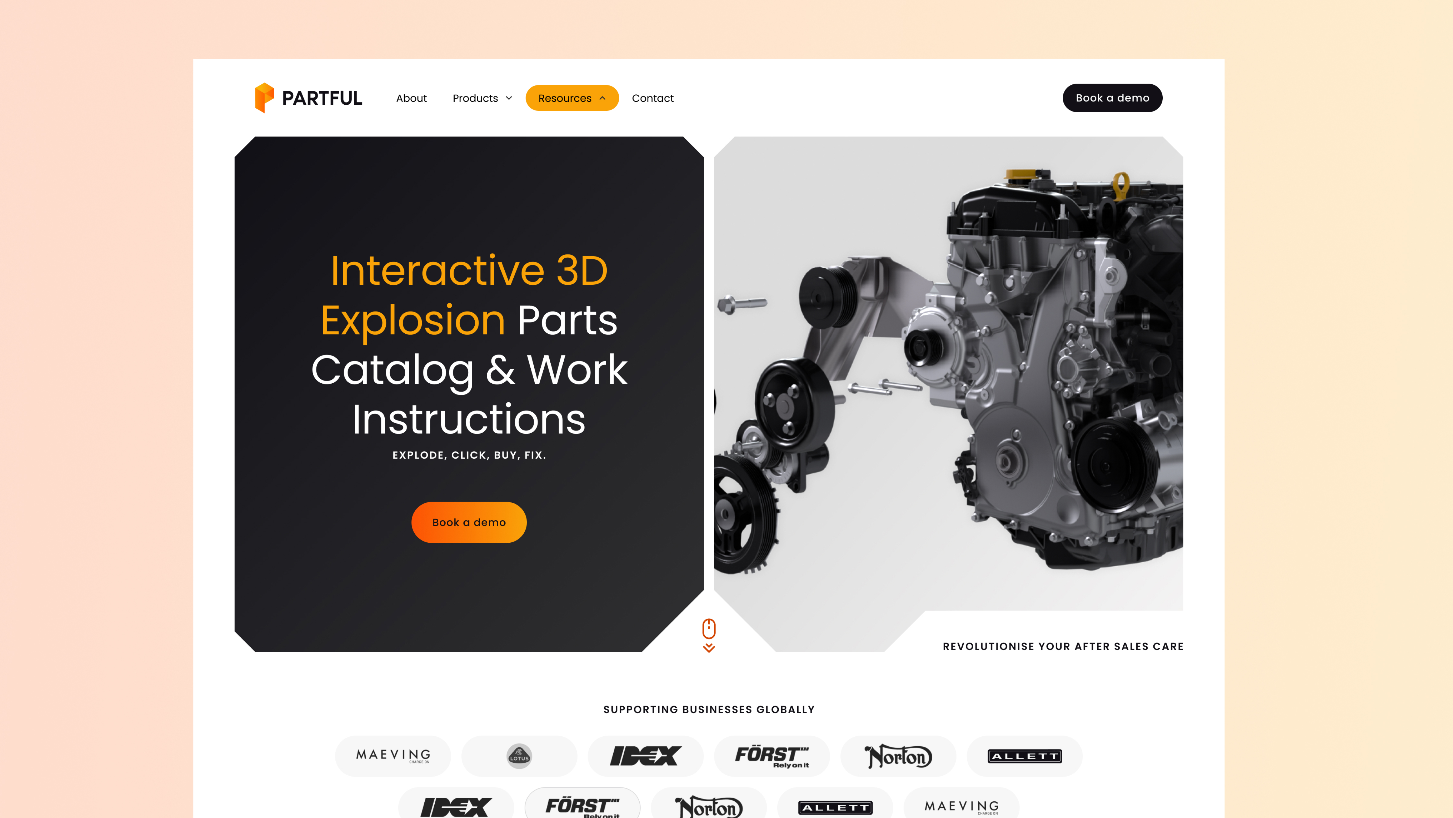
Partful
Partful's website offers a creative and engaging experience. Video, animation, and high-quality photos blend together to clearly showcase their product. The header section has a unique design that includes the key elements you need to see first: the core message, call-to-action, and social proof. Their vibrant colour palette highlights important elements like value propositions and calls-to-action.
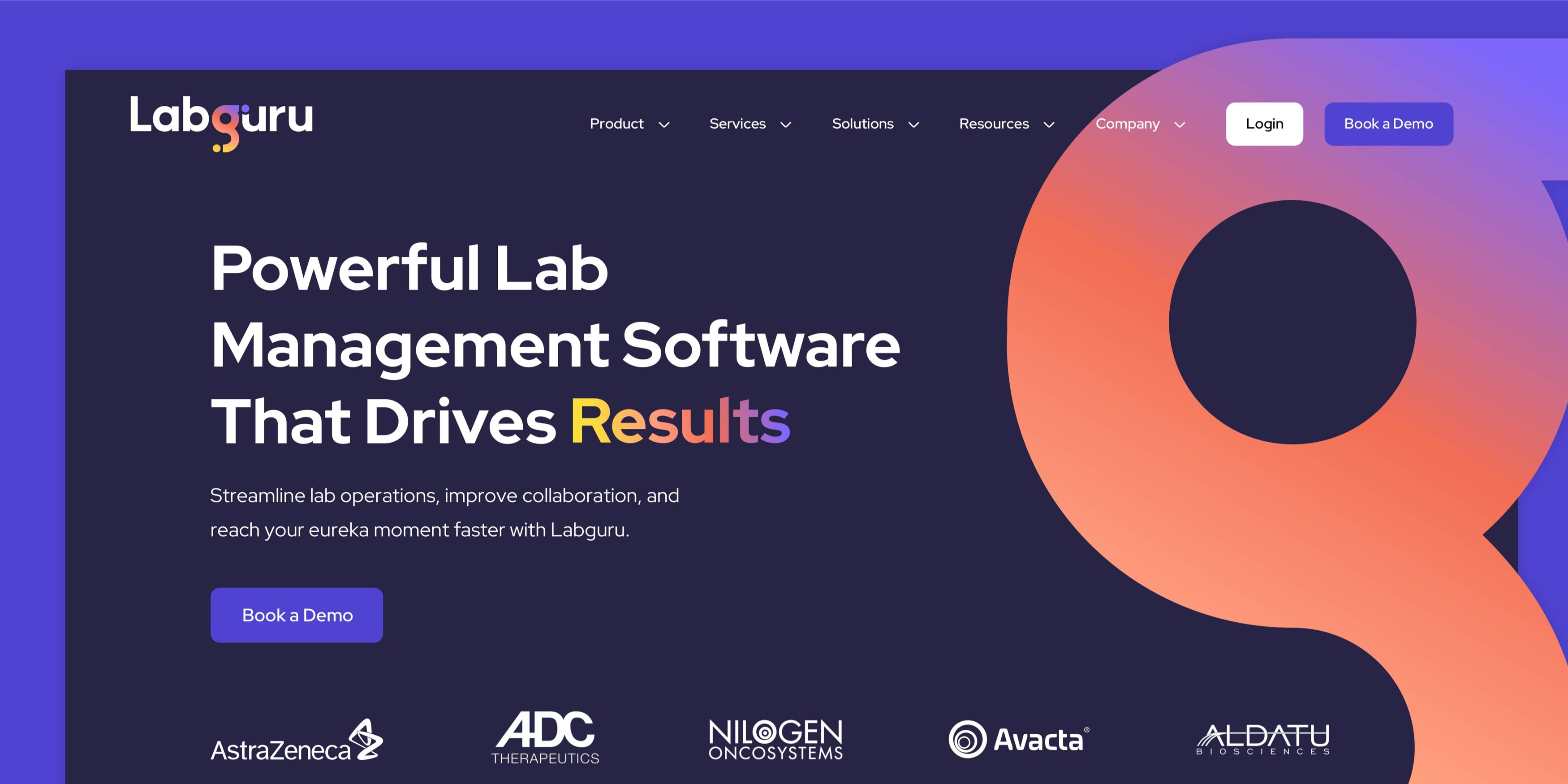
Labguru
Labguru's website is a fantastic example of punishing the boundaries of creativity on HubSpot CMS. It's a beautiful extension of their brand and brings it to life digitally. Throughout the website, there is a strategic use of animation to communicate clear value propositions and to visually showcase the platform. The website user experience seamlessly guides buyers to key pieces of information and ultimately, demo requests.
As with all life science companies, showing data and research is extremely important. Labguru has made use of HubDB to create a Resource Hub that's easy to maintain from an editor's perspective, and easy to navigate from a user perspective.
Robin Radar
Robin Radar's website combines sophisticated design elements - including a dark theme, bold typography, and premium photography - to create a powerful digital presence.
The design prioritises clear product information presentation while optimising conversion paths for high-intent buyers. This strategic approach drives pipeline growth and revenue by facilitating a seamless, informed decision-making process.
Acre Security
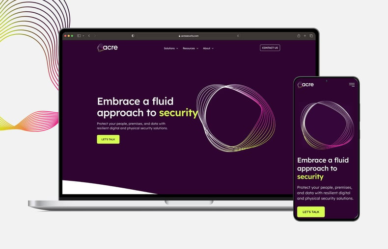
Acre's website showcases its vibrant brand and delivers a compelling message through clear and bold design elements. As soon as visitors land on the homepage, they are greeted by an animated logo that dynamically morphs and captivates, perfectly embodying the forward-thinking brand.
As you navigate through the website, a consistent look and feel follow you, ensuring a cohesive visual identity. Stock imagery is thoughtfully treated with brand colours, maximising every opportunity for brand recall and creating a seamless journey throughout the site. The navigation is designed to be both simple and effective, guiding visitors effortlessly through the content. And strategically placed clear call-to-action buttons use direct text, providing visitors with a distinct path to high-intent conversions.
CHI Overhead Doors
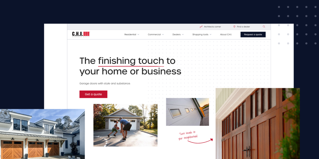
CHI's website reflects its premium brand with a clean design and high-end photography. It features custom functionality, such as an advanced search built with HubDB that lets users find their ideal model with ease. Clear paths and journeys cater to residential and commercial buyers, making it easy to find the information required and request a quote when ready.
Equiem
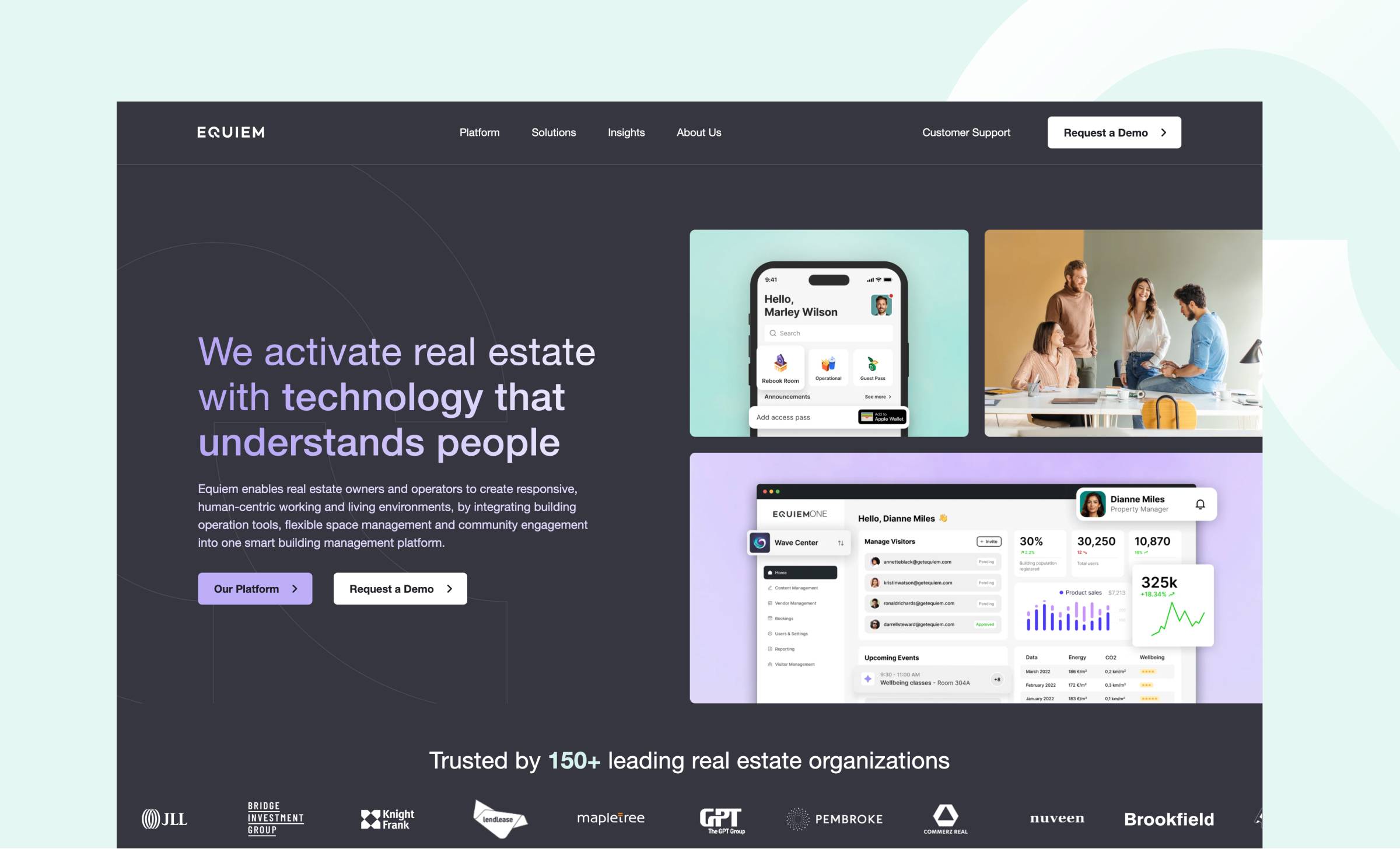
Equiem's website is everything you'd want for a SaaS business. The brand's look is consistent across the site, with colours used thoughtfully in text and images, while the logo elements stand out against the backgrounds. The design balances software and lifestyle imagery to demonstrate how the platform works while appealing to buyers with relatable photography.
When you get into the website, the user experience makes it easy for visitors to explore Equiem's offering, while optimised conversion paths capture high-intent demos to increase pipeline.
Wavenet
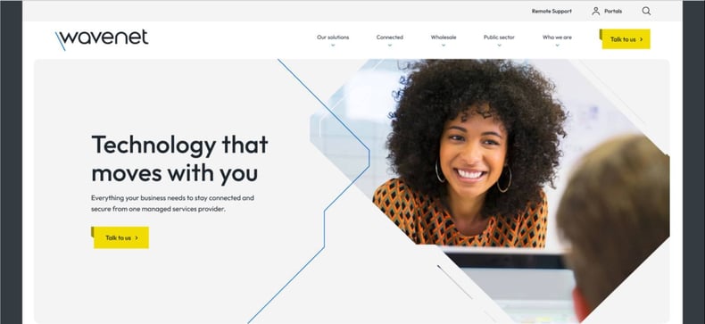
Wavenet's website has a sleek, clean, modern tech design. Image masks transform standard stock photos into a distinctive style, while ample white space improves readability and scannability, which provides a fresh appearance. Strategic use of colour and icons effectively separates market solutions, creating a user-friendly experience that aligns with the website's primary objective: high-intent website conversions.
Breathe
Breathe's website takes full advantage of HubSpot CMS's advanced features. The mega nav segments Breathe's products into categories, with clear titles and explainers, to help visitors navigate their compelling portfolio. The website also features a dynamic filterable partner directory that helps users find the right partners for their needs.
An interactive pricing page helps prospects get a clear understanding of costs associated with Breathe's software, by allowing users to tailor their quote based on the size of their business and the products that they require. A portfolio of digital calculators helps to increase engagement and supports pipeline generation.
Cybexer
CybExer's website brings their brand to life through practical yet impactful design choices. The innovative image grid system provides a robust framework for structuring complex content across the site, ensuring clarity and intuitive navigation even when presenting intricate cybersecurity services and concepts.
The thoughtful colour palette plays a crucial role in the user experience, with deep blue creating an accessible foundation, while strategic touches of red guide visitors' attention to important elements and key conversion points throughout their journey.
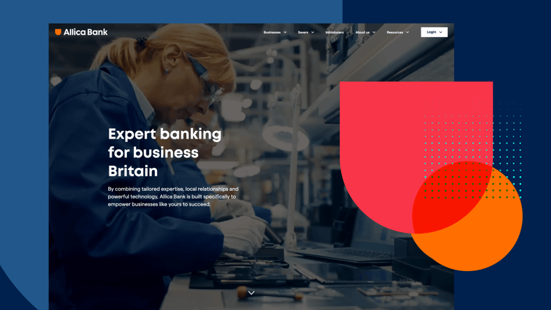
Allica Bank
Allica Bank's website utilises video in its homepage hero to reflect the businesses they help. This creates an instantly engaging experience that visitors can resonate with. The website uses photography strategically with brand assets overlayed to create a connection between the visitor and their business.
The navigation is clean and well executed to cater to both new and existing customers, ensuring all visitors can seamlessly reach their desired goals.
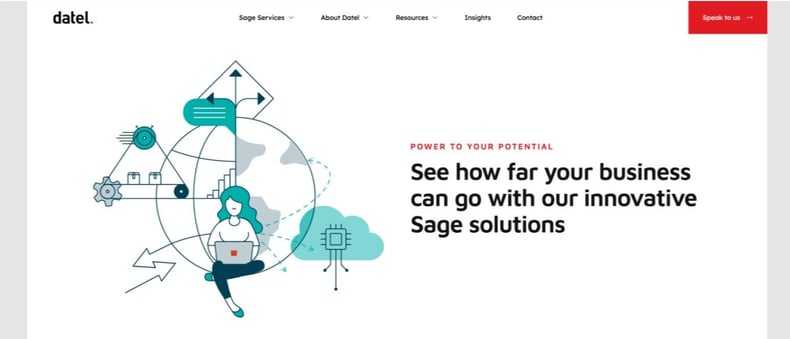
Datel
Datel's website is a perfect extension of their brand. Hand-drawn illustrations take centre stage, working in combination with clear messaging to reflect their innovative solutions. With careful integration of their iconic red square, a seamless and consistent visual theme is maintained throughout the website.
By combining proven website UX principles with a distinctive visual style, every page offers an intuitive experience, guiding users to key information and conversion points.
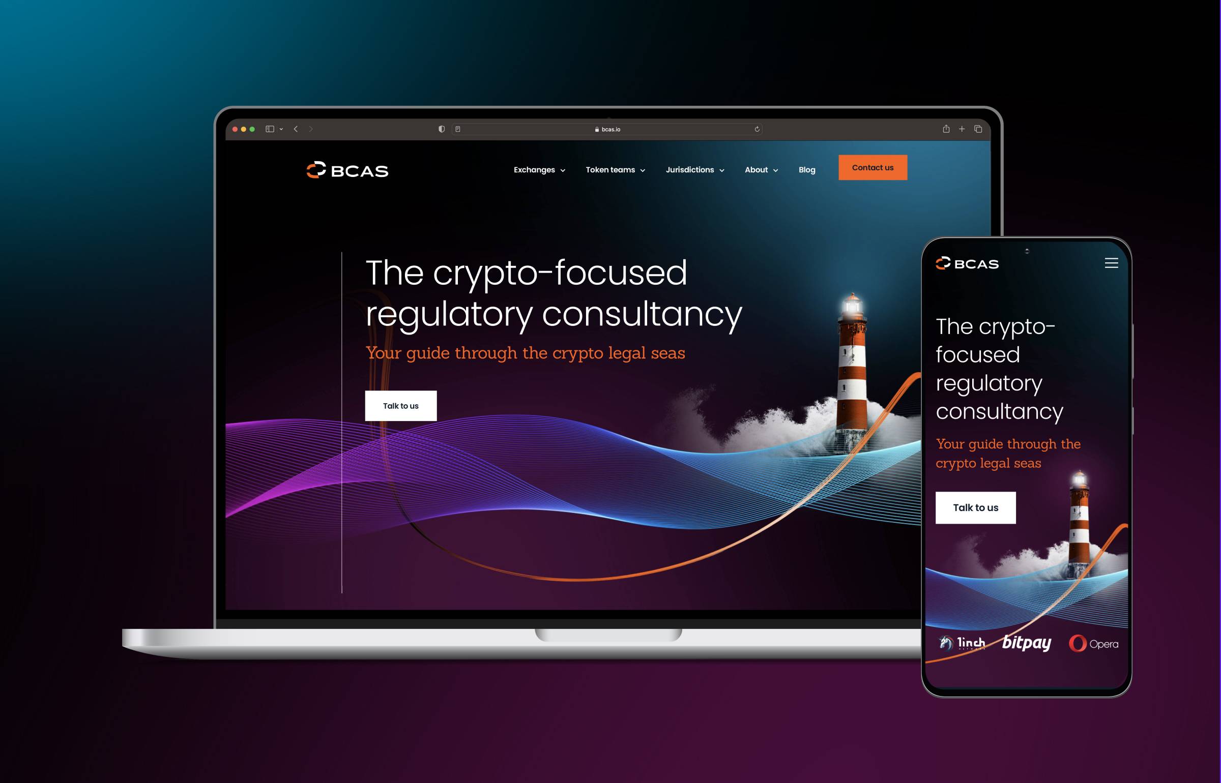
BCAS
BCAS' website stands out with its unique design and stylish photography, perfectly complementing their brand. Once you land on the homepage, you're greeted with clear positioning and eye-catching visuals that continue to impress throughout the site.
The interactive globe module showcases BCAS' best crypto-friendly locations, fitting in beautifully with the overall design. The website offers an intuitive and engaging user experience, effortlessly guiding visitors to important information. Plus, they've got well-defined conversion paths, ensuring it's optimized to generate a strong pipeline.
Greyparrot
Greyparrot's website is bold, vibrant, and exciting. It immediately catches the attention of visitors with its visually stunning design and captivating elements. The homepage, in particular, features an engaging background video that draws visitors in and immerses them in the website.
To maintain a consistent look and feel throughout the website, brand elements from the logo are strategically placed behind visuals. This not only reinforces the brand identity but also adds a touch of creativity and uniqueness to the overall design.
Greyparrot's product pages are brought to life with engaging animated visuals. These visuals effectively showcase the features and functionalities of the platform, making it easier for visitors to understand the value it provides.
Prevounce
Prevounce's website exemplifies deep audience understanding, with every element carefully crafted to resonate with their target market.
The design blends stock imagery with software screenshots, creating an effective balance that both appeals to their audience and showcases their platform capabilities. These visuals are enhanced through integrated brand elements, ensuring a cohesive look throughout the site.
The website's architecture demonstrates strategic planning, guiding visitors naturally to essential information while incorporating prominent calls-to-action that are optimised to capture high-intent conversions.
Biocair
Biocair's website engages a global audience and is primed to support the business as it scales into new regions. The brand reflects its global operations, giving them a corporate feel to promote trust and transparency. Bold imagery and video add striking visual elements to the site, showcasing the people of Biocair as well as their expertise. The navigation helps visitors find the information they need quickly and easily.
An interactive map helps visitors locate regional offices within Biocair's global network. Built using HubDB, the map can be easily updated by the marketing team as they grow their network of office locations. Smart CTAs display the details of the regional salesperson nearest to the visitor, adding a personal touch. The addition of a language switcher to the website header means Biocair can display multi-language variations of their content in different regions.
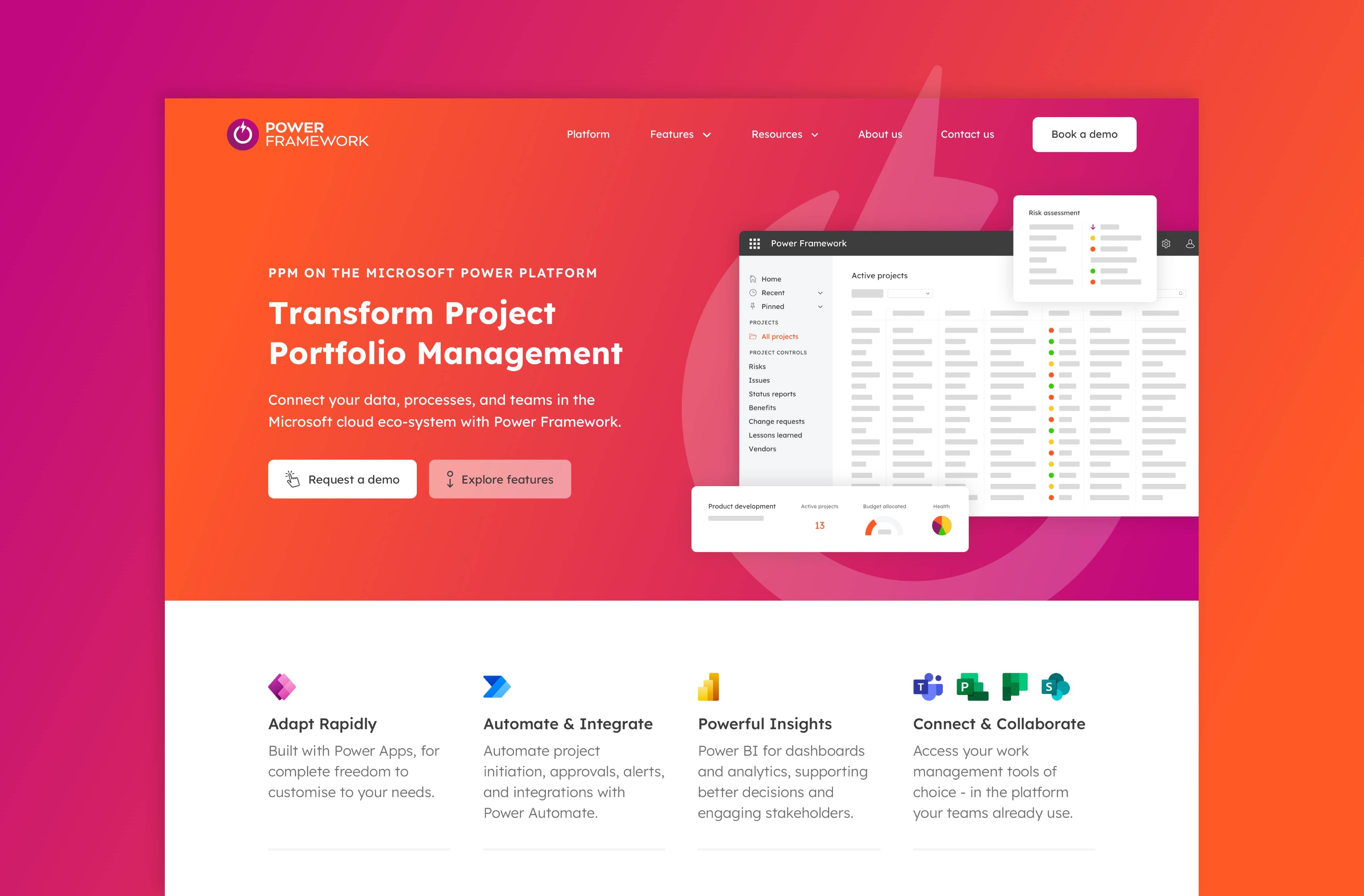
Power Framework
Power Framework's website uses the strength of their vibrant brand to stand out and demonstrate the value of their solution.
Dynamic video content and stylised screenshots give the user an immersive experience even before they request a demo. Simple, accessible navigation makes it easy for visitors to learn more about the tool and discover Power Framework’s industry expertise in the Resource Hub. The improved user journey guides visitors to key conversion points.
The Room
The Room's website provides a unique user experience for two distinct audiences - influencers and brands. The website and navigation have been split into two sections, each with its own vibrant colour scheme. Each section features its own blog, resources, and calls to action, providing clear conversion points tailored to the needs of its audiences.
Powerful copy conveys the Room’s message of finding true love in authenticity. The vibrant design, with its hand-written style, bespoke icons, animation, and distinct shapes, add personality to the brand while keeping a consistent look and feel across the site.
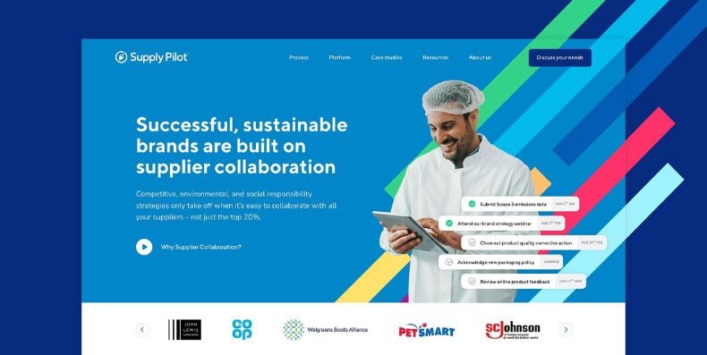
Supply Pilot
Built on HubSpot CMS, Supply Pilot's website is bold, informative and intuitive to use. Above the fold, the homepage instantly combines bold branding, clear positioning, and strategic placement of social proof to make an instant first impression. Supply Pilot uses product visuals in combination with stylised stock imagery to resonate with their audience. Clear page layouts and effective web copy means that pages are easily scannable and visitors can find the information they need as quickly as possible.
The Resource Hub is a great example of HubDB in action. It serves buyers with a highly tailored experience, which they can filter by industry, role, and stage in the buying journey.
Shawcity
An effective combination of website technology and design provides Shawcity's website visitors with a modern, intuitive eCommerce experience. The integration of Shopify creates a reliable, robust, and sophisticated eCommerce store that offers customers a simple and frictionless user experience.
The homepage clearly defines what Shawcity offer, and the benefits of using their products and services. The sub-navigation tab segments their products into categories, helping visitors to find and purchase the right products easily. Strategically placed CTA buttons guide visitors towards their online store and featured products.
Ecrebo
Ecrebo's website clearly communicates how their software can support retailers to grow their sales using POS data. The simple navigation tab helps provide a smooth customer journey, guiding visitors to the SEO-optimised product pages, with custom illustrations, snappy copy, and testimonials that showcase the benefits of the software.
An innovative 'tour' page shows how the software works and makes it clear how it can be used by retailers to deliver personalised offers and messages. The addition of clear calls to action steers visitors to key conversion points, supporting pipeline generation. The website is nicely tied together with a modern, bold and clean brand.
Biostrata
Biostrata's website displays its unique value proposition and promotes its services with clarity and confidence. The visually striking website reflects the expertise, experience, and passion of the agency. Subtle animations, abstract imagery, and a tree diagram format enhance the scientific aspect of their brand and establish their unique identity.
The improved navigation and clear CTAs provide an intuitive customer journey. The website not only demonstrates Biostrata's marketing prowess, but perfectly reflects their affinity with their target audience.
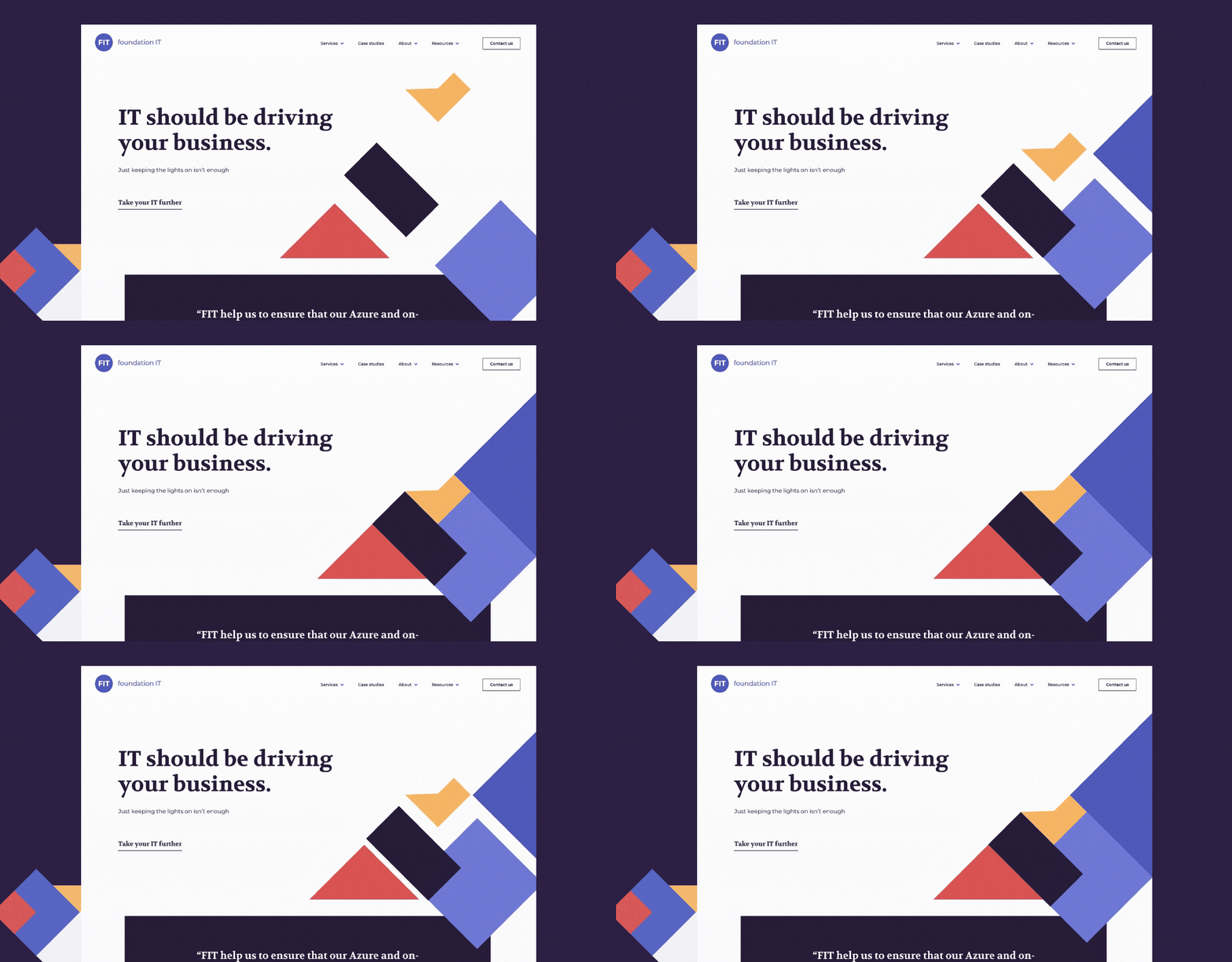
Foundation IT
Foundation IT's website stands out from the crowd, with its bold colours, abstract style, and clear brand messaging. No corporate blue, no stock imagery, Foundation IT’s site is as unique as they are, representing their people, process and offers. The addition of animation to the homepage and short snappy copy help differentiate their brand in a congested marketplace.
Considering using HubSpot CMS for your website?
If you're considering using HubSpot CMS for your website but are unsure if the platform is right for you, book a demo with one of our experts.
Our CMS specialist will guide you through:
- An overview of HubSpot CMS and Content Hub's key features
- A live demonstration of the website editing experience
- A showcase of the AI tools available in Content Hub
If you have any questions about the platform, we'll answer them for you, enabling you to make an informed decision.



.png?width=1200&name=Blog%20post%20BHR%20(2).png)

.jpg?width=790&height=519&name=1_Home-Page-1%20(1).jpg)

.png?width=1200&name=Blog%20post%20BCR%20(1).png)
.png?width=1200&name=Blog%20post%20TRM%20(1).png)

.png?width=1200&name=Blog%20post%20SWC%20(1).png)
.png?width=1200&name=Blog%20post%20EBO%20%20(1).png)
.png?width=1200&name=BST%20blog%20post%20(1).png)
