Datel

Putting the brand first on HubSpot CMS 

Project type

Brand, Website

Services provided

Branding, Copy, Design, Development, Strategy

Location

United Kingdom

1_Datel header

About the project

As the UK's leading Sage Business Partner, Datel specialises in creating innovative software solutions that are tailored to match their customer's strategic ambitions. Recognising the need to modernise their website and bring their brand, rather than Sage's, to the forefront, Datel approached us to create a new website, built on HubSpot CMS.

 

Some may find the responsibility of crafting a brand’s evolution daunting. At Blend, we welcome the opportunity to focus on enhancing the finer details, with care and consideration.

Wayne Harris.
Art Director at Blend

Logo development

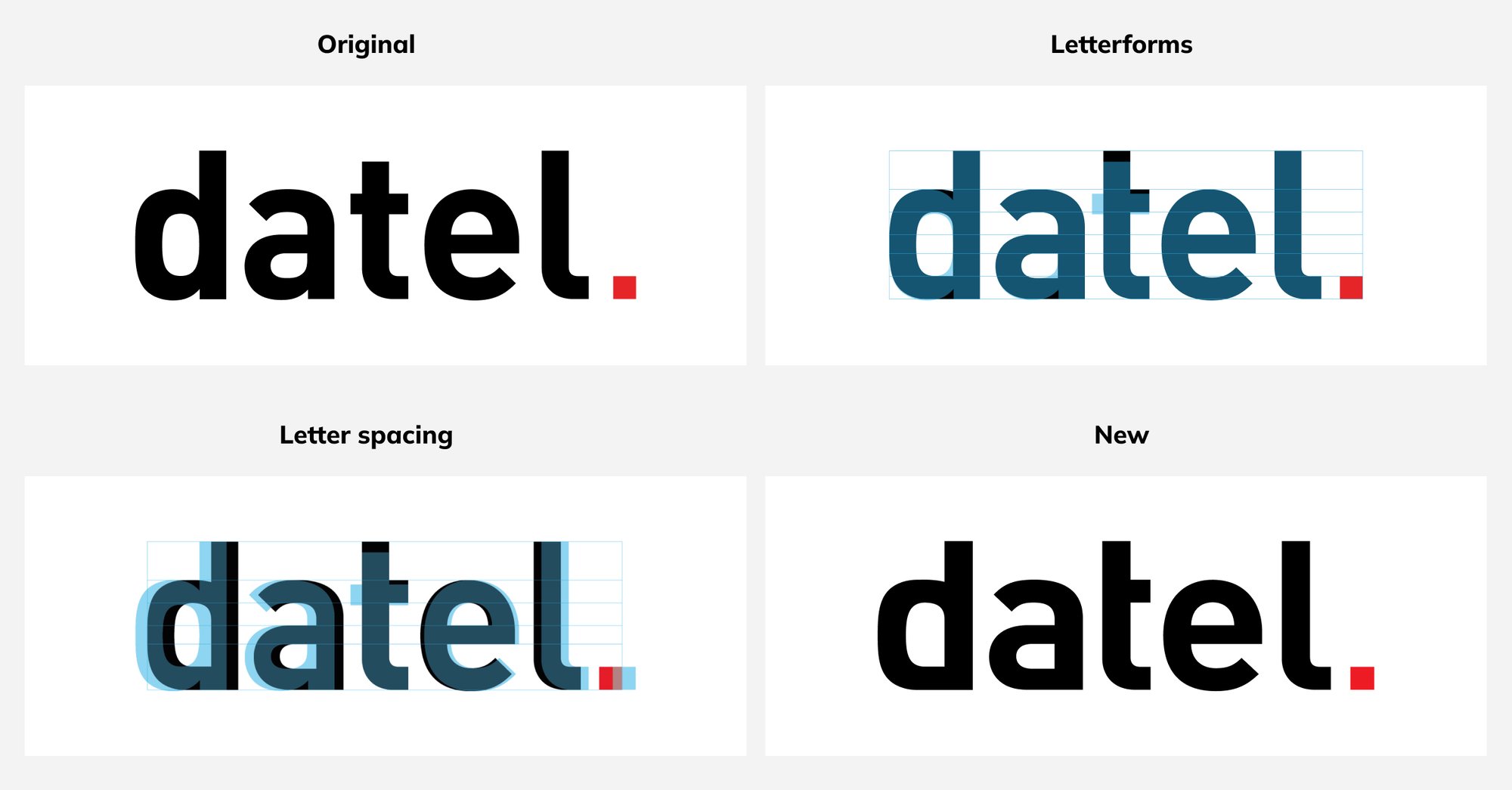
With a focus on both legacy and innovation, Datel wanted to capture 40 years of heritage in a fresh, modern style. Through careful refinement, we transformed the original Datel logo into a fresh, hand-drawn mark that beautifully bridges the past and present.

2_Datel logos
3_Colours

Extended colour palette

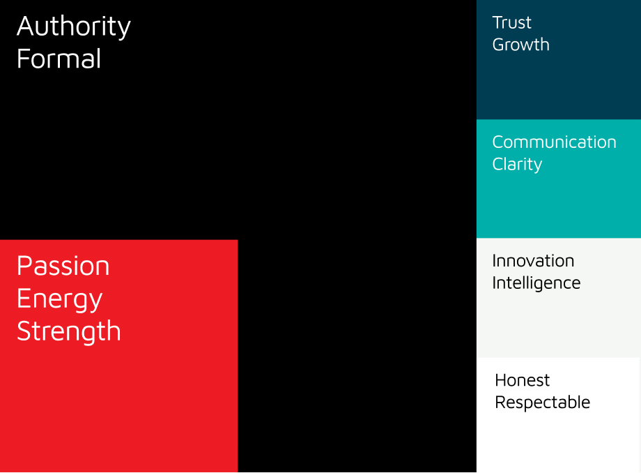
As we continued to shape Datel's brand, a crucial aspect involved refining their established colour palette. With their signature red now serving as a dynamic accent, we extended the colour palette to reinforce their brand identity. The selection of complementary colours resonates with the company's values and provides them with the flexibility to use their brand in a range of contexts.

Brand imagery

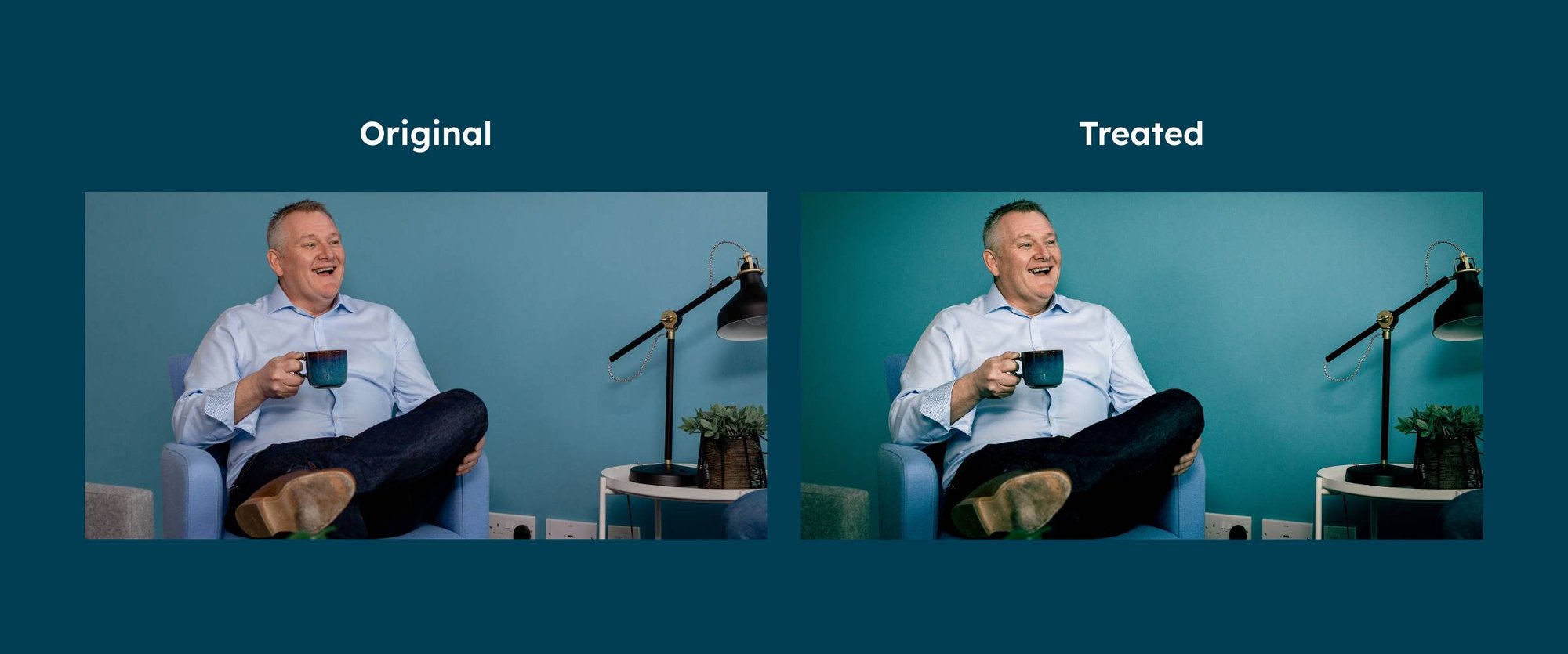
To reinforce Datel’s new brand style, we used colour grading throughout their photography. This treatment of colouring and photography strengthens the overall brand image, with every element of their identity being considered and integrated into the website.

4_Image treatment

Illustrative style

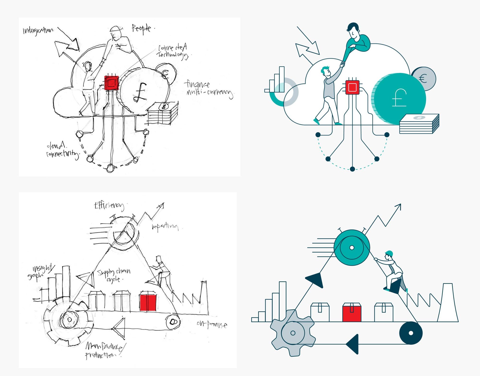
To effectively represent the key functions within their various Sage solutions, an illustrative style was created that enabled graphic compositions to be designed.

5_Scamps

Website transformation

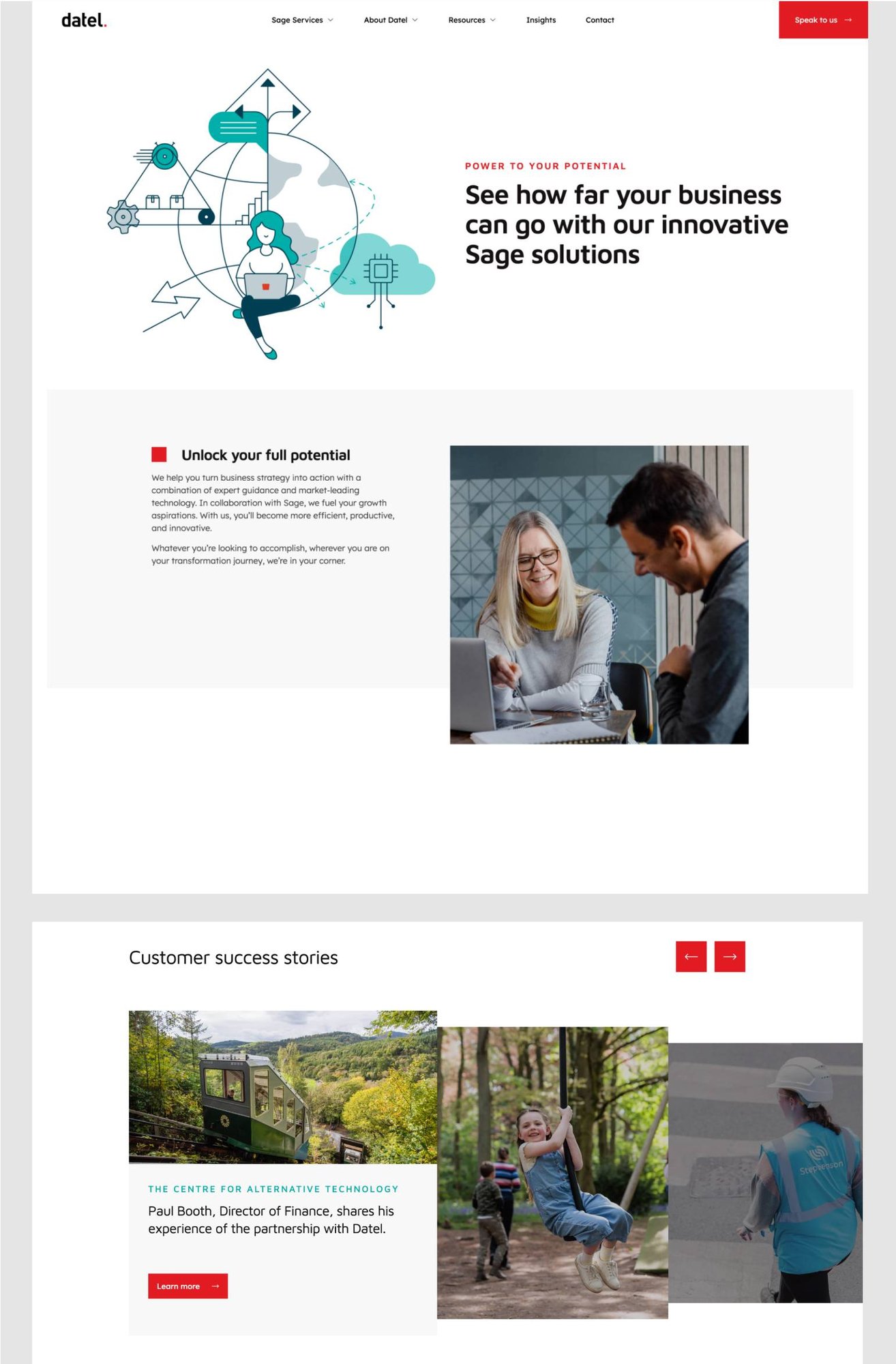
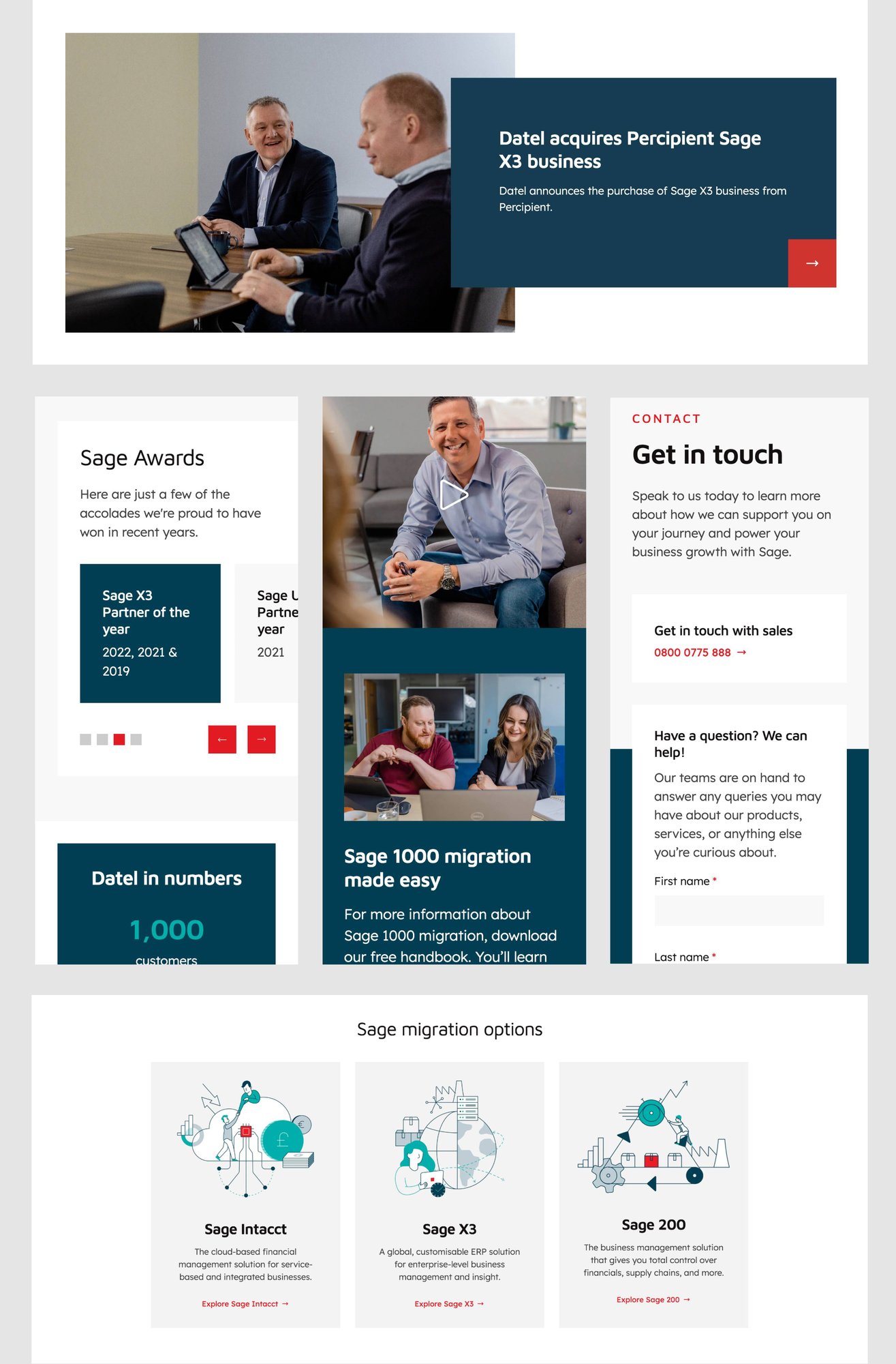
Datel's new website perfectly mirrors their redefined brand. The newly created illustrations take centre stage, working in combination with clear messaging to reflect their innovative solutions. With careful integration of their iconic red square, a seamless and consistent visual theme is maintained throughout the website.

By combining proven website UX principles with a distinctive visual style, every page offers an intuitive user experience. At its core, the website reflects its central objective: converting high-intent leads.

DTL Website-1
DTL Website-2

Explore more work

Transpoco

Brand, Website

Explore project White hover arrow/title>

Transpoco Work Thumbnail

Cybexer

Brand, Website

Explore project White hover arrow/title>

Cybexer Work Thumbnail

Inshur

Brand, Website

Explore project White hover arrow/title>

Inshur Work Thumbnail

CapEQ

Website

Explore project White hover arrow/title>

CapEQ Work Thumbnail

Algorand

Website

Explore project White hover arrow/title>

Algorand Work Thumbnail

Robin Radar Systems

Website

Explore project White hover arrow/title>

Robin Radar Systems Work Thumbnail

Prevounce

Website

Explore project White hover arrow/title>

Prevounce Work Thumbnail

Equiem

Website

Explore project White hover arrow/title>

Equiem Work Thumbnail

Partful

Website

Explore project White hover arrow/title>

Partful Work Thumbnail

Second Nature

Website

Explore project White hover arrow/title>

Second Nature Work Thumbnail