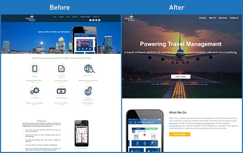
A fresh website for our travel industry client Mantic Point led to a 200% increase in organic visits, and 12 demo requests in the first month after launch.
Frustrated Ambitions – Bad SEO and Low Conversion
Travel management software company Mantic Point had worked with our content team for 12 months, creating their insightful Travel Apps Blog and a series of guides and Q&As on areas such as mobile strategy for travel management and travel risk management. Despite great feedback from their existing network of contacts, they were struggling to reach new audiences and potential customers.
Despite previous improvements to metadata, our SEO experts identified serious problems with Mantic Point’s legacy Wordpress site which were hampering their organic traffic performance. With a non-responsive design and unclear customer journey, the website's conversion rate was low, with many new contacts being created after sales engagement rather than before.
It was time for our web development team to get to work.
Design and Development - Simple and Effective

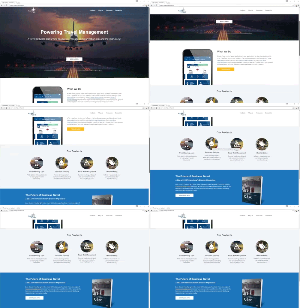
A clean, flat design was chosen for the website, with an emphasis on travel photography and simplified icons. A simplified palette brought visual consistency to calls to action, headings and links, while a motion hover state on the home page gave it a dynamic feel. Ensuring that the site was responsive was a top priority, given Mantic Point’s specialisation in Travel Itinerary Apps.

Working closely with Mantic Point’s product team, our SEO and content team produced a new sitemap, matched against specific keywords to ensure content was created with optimisation and customer journeys in mind.
Launch and Results
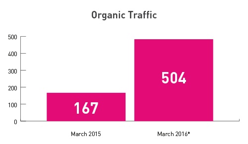
The new site launched the day before a major travel industry show, and the results have been fantastic ever since. Compared to March 2015, which only saw 167 organic visits to the site, March 2016 has seen 504 to date*. Even compared to the last full month of the old website in January when there were 247 organic visits, the increase is over 100%.

The increase in conversions has also been fantastic, with a 400% rise in organic contacts over March 2015, and 100% increase in all contacts month-on-month despite a major trade show in February 2016.
What's more, the new site has received 12 product demo enquiries in its first month, beating the all time previous record of one.
The Next Steps
What makes Blend unique is its dedication to creating ongoing inbound marketing success for its clients. Work on the site is far from ‘over’, as our content team continues to use the Keywords and Competitors tools in HubSpot to identify opportunities for new pages, such as an upcoming page emphasising the combined power of Mantic Point's products.
We’ve talked recently on our blog about the importance of optimising blog posts for B2B inbound lead generation, and the results here show why. When you create content that is discoverable and converts, you begin a constant cumulative effort that increases your results month-on-month and year-on-year. Getting started with this process marries effective digital marketing strategy with the knowledge and content hidden within your own organisation.
We’re thrilled with the results we’re seeing for Mantic Point, and look forward to bigger and better for them in the months and years to come.
If you're looking to improve your own website, why not download our guide to driving more traffic, leads and sales to your website?

*as of March 30th


