A well-crafted pillar page provides an accessible, high-level overview of a broad topic you want to rank for. It answers all the burning questions your readers might have on a single page, with more detailed discussion of specific aspects of the topic reserved for the content you create around it.
This is called the topic cluster model, a variation of the hub and spoke approach.
When done correctly, a pillar page can broaden your search engine authority and help you rank for high-value search terms by establishing links between your pillar page and supporting content.
So, what are the key features of an effective pillar page?
The anatomy of an effective pillar page
The easiest way to understand what makes an effective pillar page is to take a closer look at some successful examples. In this blog, we show you how the likes of Help Scout, Typeform, Profitwell, Gather Content, and HubSpot have achieved SEO success using the pillar page model. Alongside one of our own top performers - The Complete Guide to Effective B2B Website Design.
Every company featured in this blog takes a slightly different approach to their pillar pages - including us. But we have picked out some common themes, trends, and elements that make a good pillar page strategy great.
The 9 key elements of an effective pillar page are:
Main website navigation
Unlike conversion optimised landing pages, pillar pages focus on search engine optimisation and traffic acquisition.
You should always remove distractions, like navigation links, from a conversion optimised page. Anything that draws attention away from your conversion offer is unnecessary. But when someone visits a pillar page, you want them to be able to continue their journey on your website after they arrive.
One way to achieve this is to include your website's main navigation in your pillar page template. This means visitors can easily explore other areas of your site and are, therefore, more likely to do so.
In addition, including your main navigation ensures that your pillar pages effectively support the SEO of your main site pages and vice versa.
Not all the pages we reviewed featured the main website navigation. This may indicate differences in the underlying strategy or indicate their age.
The older pillar pages in the set were perhaps created with a view to acquiring backlinks via outbound content promotion. Whereas the more recent pages may be geared towards organic traffic acquisition strategy.

Main navigation (and page title) on HubSpot's pillar page on customer feedback
Page title
When creating a pillar page, you should target keywords that are short, broad, and competitive. These keywords should also feature very prominently in the page title.
The majority of the pages we looked at use short page titles that consist of the target keywords and little else.

Page title from Yoast's pillar page on SEO copywriting
Accessible, ungated content
The entire pillar page strategy is based on the creation of lengthy, comprehensive content. It must be easily accessible, and this means presenting it openly, on-page.
Long-form content requires careful layout, with special consideration given to structure, typography, use of images, and more.
You can create a serviceable pillar page using a simple template and layout. But if you want to optimise your content for reader engagement, you need a bespoke template. And this means enlisting the help of a designer and developer.
There wasn't much to separate the pages we looked at in terms of length and level of detail. The main differences were in the quality of the designs, with some being much easier to read and more visually engaging than others.
Pillar page content sections
Given the likely length of your pillar page, it makes sense to separate the content into logical sections. Organising your content around sub-headings aids readability and engagement, helping readers keep their place or find specific information.
You might include a table of contents at the start of your page, along with internal navigation and other design elements to help readers locate the sections that are most applicable to them.
In most of the examples we looked at, each section was presented on a single page - with one notable exception. ProfitWell's SaaS project presents content sections on individual pages, perhaps due to the length and depth of the piece which is really made up of multiple pillar pages on closely related topics.
Internal navigation
Building on the long format nature of the content and the need for logical sections within it, another popular element of an effective pillar page is internal navigation.
Internal navigation helps readers engage with long-form content and prevents them from feeling overwhelmed. Rather than consuming it one go, they're able to quickly jump to the most relevant sections or read it over multiple visits.
There's no universal standard for pillar page internal navigation, and this was borne out by our research. Popular approaches we noticed include:
- Contents/index sections
- Floating sidebars
- Horizontal navigation bars
- Dropdowns
- Pop-outs
- "Hamburger menus"
While the optimal approach depends on the content, our favourite style is a sticky, secondary navigation.
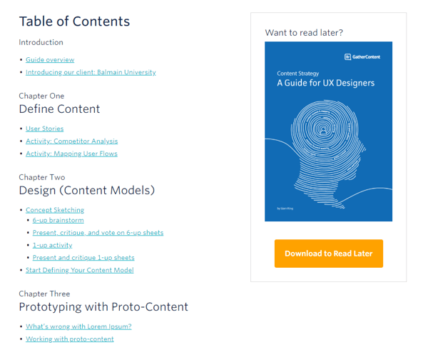
Internal navigation (including download offer) on Gather Content's pillar page on content strategy
External resource links
A pillar page should, first and foremost, be a useful resource for your readers. This helps you achieve prominent ranking in search engines, engage visitors, build trust, and establish subject matter authority. One way to do this, and to signal the fact to search engines, is to include links to useful external resources.
Research by HubSpot found that the more relevant, external content you link to on your pillar page, the higher it ranks in search engines. Context is key when linking to external resources. Only include a link if it makes sense to do so. You can also present them in groups or at the end of relevant sections.
Linking to relevant internal resources is also valuable. But you must find the right balance between internal and external links, and make sure you don't overdo it.
.png?width=600&name=BLD%20-%20Help%20Scout%20Pillar%20Page%20Resource%20Linking%20Example%20(Screengrab).png) Resource linking on Help Scout's pillar page on customer acquisition
Resource linking on Help Scout's pillar page on customer acquisition
Calls to action
Like your blog posts, pillar pages are designed primarily to attract visitors in the early stages of their decision-making process.
Your main website navigation allows them to continue their journey if they wish, but strategically placed calls to action (CTAs) can help visitors jump off and dig into topics that interest them. This creates additional opportunities to convert visitors who enjoy your ungated content into known leads.
You should always include a banner CTA at the end of your content, as well as strategically-placed text CTAs at relevant throughout the page. Text CTAs are less disruptive and help convert visitors who prefer to scan long-form content or are looking for specific information before they exit the page.

A call to action on HubSpot's pillar page on customer feedback
Download option
Search engines can only index your pillar page content if it's ungated. But that doesn't stop you from including a download option for readers who want to consume the content offline. In fact, this can help you convert more visitors into leads.
Places you could include a download CTA:
- Header
- Navigation
- Introduction
- Conclusion
There's no right or wrong location for a download CTA. In most cases, the design of your pillar page template and the user experience will inform your decision. If you're not sure, consider adding several throughout the page.
Alternatively, you could include an exit intent pop-up. Pillar pages are one of the more permissible places to include this particular element. If the reader has reached a certain point in your pillar page or spent a predetermined amount of time on it, they might appreciate having one last opportunity to download your content.
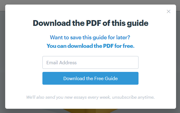
Download offer on Help Scout's pillar page on customer acquisition
Website footer
Just as with your main website navigation, you should include your website footer on your pillar page.
When a reader arrives at the end of your pillar page, website footers provide valuable links to additional information, enabling them to continue their journey. Footers are also important for SEO because they link to key pages within your site.
Find the formula that works for you
You don't have to include every one of these elements to create an effective pillar page. But by following these best practices, your pillar page is more likely to drive traffic, improve engagement, generate leads, and increase demand.


