Great inbound marketing content does more than engage and delight in isolation. It allows users to take a step further down the road to becoming a customer. And we do this by making sure great content has great calls to action.
What are CTAs in content?
Calls to action (CTAs) are devices that prompt users to take an action. They're a key part of making a website an effective marketing asset. CTAs take on a range of forms based on their placement. Links and buttons on webpages, longer text links and banners in content.
CTAs differ due to a range of factors – from the action you want the user to take, to the strategic goals of the content, and even the type of content itself. But they share five common attributes. Great calls to actions are:
- Specific
- Predictable
- Valuable
- Proactive
- Contextual
Specific and predictable CTAs are more trustworthy
Vague CTAs have a lower click-through rate. It’s important to tell users exactly what they'll get and what will happen when they click. One of the traps we see a lot of brands fall into is that they write a vague CTA because “it matches the tone of voice”. You need to be able to balance tone with the needs of the user; style with substance.
Here’s an example:
Friendbuy A/B tested two CTAs against a baseline: “Wanna see it? Share Friendbuy with friends!”
“Test it out.” Vs. “See demo.”
Both variants performed better than the original, but “See demo” performed 211% better than the baseline and 82% better than “Test it out”.
Why? Because the CTA meets the user’s expectations by telling them exactly what they’re going to get.
We’re all more sceptical of online content as we learn about cunning phishing scams and other nefarious online activity.
When you give people complete transparency, they can trust that clicking your CTA won’t lead somewhere unexpected. So, rather than just saying "click here for more info", try "download our latest whitepaper on X".
Show value upfront
Inbound marketing is a means of generating opportunities without interrupting them with sales pitches. This is why we create informative, engaging content. Calls to action can disrupt the hands-off approach and break the spell if they’re too mercenary.
“Read our whitepaper on B2B Inbound Marketing” might be the action we want people to take, but we secure a higher click-through rate by demonstrating value. We tell you that you’ll learn something about a powerful approach to generating leads and sales.
Proactive words in CTAs increase clicks
Use imperative verbs to stimulate people into action. Words like 'explore', 'download', and 'request', give people agency. You can further encourage action by reinforcing positive rather than negative emotions. The best example of this can be found in forms.
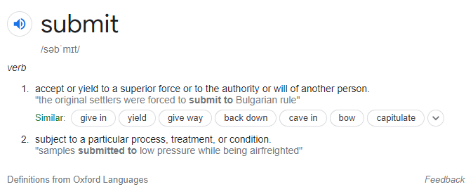
 Submit is a word you see a lot on web forms. You fill in your details and hit the submit button. But you shouldn’t want your customers to submit – its passive and doesn’t reward their action. Positivity is key to winning buyer trust and even a change as small as switching to “Send” can change the way people feel.
Now they’re not submitting exam results or tax forms, they’re sending a letter and making a meaningful connection.
Great CTAs are contextual
One of the many great features of the HubSpot CMS is that it lets you create CTAs for campaigns and drop them into content fully formed. So, if you want people to click through to your demo booking page, you can make one CTA and put it in all your content. But this is a trap.
We see a better click-through rate on CTAs that are contextual to the content in which they’re found. For example, you won’t find a CTA to our B2B web design eBook here, because this article isn’t about web design.
If you use a generic CTA, you may be leaving value (and conversions) on the table. Think about where your CTA is and how it can fit most naturally into your content.
Other things to consider
A lot of psychology goes into marketing and people have written books about priming the reader for sale, creating FOMO, removing risk, and even colour psychology. These are classic marketing tactics for improving sales conversion. And they all play a part in turning opportunities into leads.
But when we’re thinking about CTAs for inbound marketing, we find it more valuable to focus on the mechanics of the CTA and how it can provide value.
Where should you put CTAs in content?
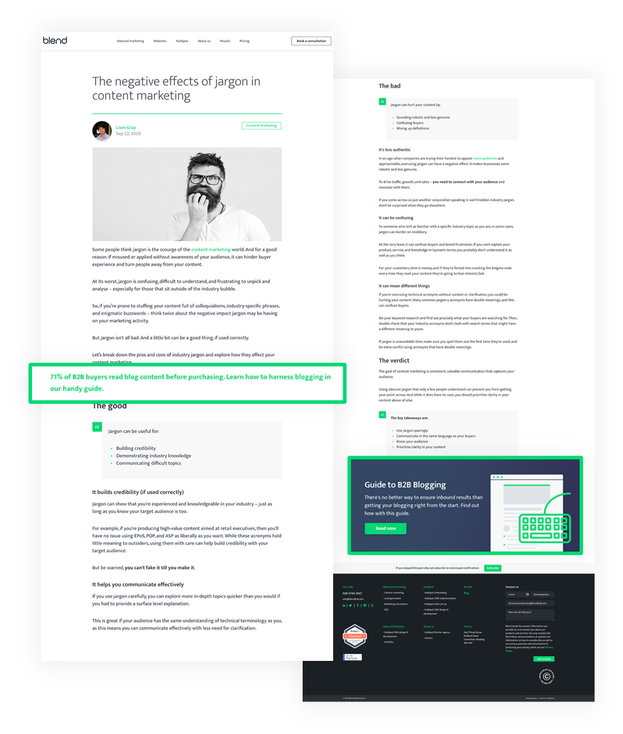
We advocate a text CTA about a third of the way down a blog and a larger, nicely designed CTA at the bottom and nothing else. This gets us the best results for conversion. You don't need to be any more intrusive than that, but you don't want to be any less than that, either. You always want to be giving value and trust in that value to drive users in the right direction.

We often say that you shouldn’t create content for content’s sake. A strategic approach should focus on addressing customer needs and improving SEO. Great CTAs play a key role in the wider inbound marketing strategy, connecting top of the funnel content to key conversion points.
Because without a CTA, no one’s going to get in touch.


