How long does a B2B website redesign take?
Mar 12, 2025
An effective B2B website doesn't just attract visitors; it converts them into valuable leads and customers. In this blog, we explore how to measure and improve your B2B website conversion rate, focusing on strategies that deliver tangible results.
When measuring website conversion rate, focus on the metric that matters most: visitor to high-intent lead conversion. These are the conversions that ultimately generate the most pipeline and revenue for your business.
To measure this effectively, start by identifying all high-intent conversion points on your website, such as:
Aggregate the numbers from these conversion points into a single metric.
Finally, calculate your conversion rate by dividing the number of high-intent leads by the total number of website visitors.

Tracking the visitor to high-intent conversion rate over time helps you better understand if your website is capturing demand effectively and contributing to business growth.
This approach provides a more informative metric than a simple visitor-to-lead conversion rate, which measures all contacts you generate from your website, regardless of intent and quality.
Now that we've established how to measure conversion rate, let's explore strategies to increase it.
- Improve your website's speed and performance
- Write clear, concise copy
- Include product imagery
- Ensure you have an intuitive navigation
- Ungate your content
- Use specific CTAs
- Apply positive friction
- Include social proof
- Optimise your bottom-of-funnel conversion page
A fast-loading website is crucial for keeping visitors engaged. Slow sites often lead to incomplete visits, as users leave out of frustration before content loads. This means you don't get the opportunity to show them how your solution could help solve their needs.
A 2023 Statista Survey shows that the longer the wait time, the more a user is willing to leave the site. It significantly increases around the 5-second mark.

Many factors impact website performance, but here are some key things to look at when trying to improve site speed:

While website speed is important, obsessing over minor improvements is unnecessary. As long as your site loads quickly enough to keep visitors engaged, shaving off a few milliseconds won't have a significant impact on overall performance.
Website speed is sometimes compromised to accommodate higher-quality visuals. This trade-off may not necessarily be detrimental, as visually appealing elements could boost conversion rates, but it's a consideration to keep in mind when optimising your website.
Your website copy should be easy to scan and digest so buyers can understand how you can help them at a glance.
Firstly, ensure your unique value proposition is clearly stated, helping visitors quickly understand how you solve their problems.
Then, use short paragraphs and sentences within your site, and incorporate bullet points for key information. Include subheadings to break up text and focus on benefits rather than just features. Visitors often skim content, so make your key points stand out through strategic formatting.
Images play an important role in any B2B website but are particularly significant for product-based businesses. For these companies, showcasing the product on the website is crucial.
Whether it's a tangible item or software screenshots, presenting clear visuals of the product helps potential buyers understand exactly what they're considering. This clarity increases the likelihood of conversion, as customers can easily envisage the value of the product.
Interestingly, one area where product imagery is often overlooked is the homepage.
Many businesses opt for abstract or lifestyle-focused images in this prime section. However, the homepage serves as the first point of contact for many new visitors and potential buyers. This makes it a golden opportunity to immediately showcase your product and its capabilities.
By prominently featuring product imagery on the homepage, you can quickly communicate your offering to visitors, setting the stage for a more informed experience.

Databox's website is a great example of using stylised product imagery
Relative to the rest of your website, the navigation is only a small section, but it has an outsized impact on the overall user experience.
To improve your conversion rate, follow these website navigation best practices:
The easier it is for visitors to navigate your site, the more likely they are to find the information they need and convert.
Your website needs to educate potential customers about your solution. To achieve this effectively, make it easy for users to find and consume information critical to their buying journey.
Restricting access to product specification sheets, case studies, and other crucial information can significantly reduce the number of potential buyers who engage with these materials. So, by gating content, you're reducing the number of buyers who can effectively evaluate your solution and become customers.
Read more: Gated vs. ungated content.
To optimise your site's accessibility of information:
By implementing these changes you guide users to information in their decision-making process, ultimately boosting conversions.
Build a B2B website that attracts, engages and converts visitors - read our complete guide here.
6. Use specific CTAs that offer a clear outcome
A call-to-action (CTA) is a critical part of driving actions and conversions on your website. They're the visual prompts and pathways that guide visitors through your website and towards a desired outcome like demo requests, purchases, or filling out a contact form – conversions like these are all influenced by the placement, design, wording, and overall quality of your CTAs.
To get more engagement on your CTAs, use action-oriented, specific language that aligns with the subsequent action.
For example, avoid vague CTAs that aren't contextual like 'get started' and 'get in touch'. These generally perform poorly when converting high-intent leads, as they require buyers to provide all of the context and information about their enquiry.
Instead, use more specific CTAs that offer a mutual benefit between your business and the buyer, such as:
These CTAs set clear expectations about what you can get if you click and make it more likely that high-intent buyers will use them as they know the next step on offer.
You could try A/B testing your CTAs to continually improve their effectiveness. Small changes in wording, colour, or placement can sometimes lead to significant improvements in conversion rates.
Not all website friction is bad. Some friction can help you get better leads that are more likely to become customers.
It might seem smart to add things like calendar widgets or live chat so anyone can easily talk to sales. But this can result in wasted time with people who'll never buy from you.
Instead, use a short form with a few key questions to add some structure to the conversion process. Serious buyers will still reach out, but you'll filter out some of the less serious ones.
By doing this, your sales team can focus on the best leads, resulting in better use of your resources.
Social proof is anything that shows your website visitor that your product, service or solution is being used and enjoyed by other real companies or people. These typically fall into the format of:
If they're implemented well, these are powerful elements to include on your website because they'll increase the trust visitors have in your solution.
To maximise the effectiveness of social proof, strategically place it throughout your website. The homepage is an excellent starting point, as it receives the most traffic. Include customer logos, testimonials, and links or excerpts from case studies here.
Additionally, position social proof in context alongside specific products or features to support your claims.
The last place to consider is your bottom-of-funnel conversion pages. Including social proof here can significantly increase the completion rate of forms and other conversion actions.
Your bottom-of-funnel offer page is critical to conversion. This is typically the page buyers come to express their interest in your offering.
Firstly, the offer that you present on your bottom-of-funnel conversion page should reflect the CTA that's used to direct them there.
For example, if your CTA is 'book a demo', make sure that you're actually offering a demo. A 'bait and switch' approach to CTAs will only negatively impact your conversion rate. If buyers think they're getting a demo after clicking the CTA, but your page says 'talk to us' they'll be less likely to follow through as that wasn't the desired action they wanted to take.
When it comes to the page itself, it should include:
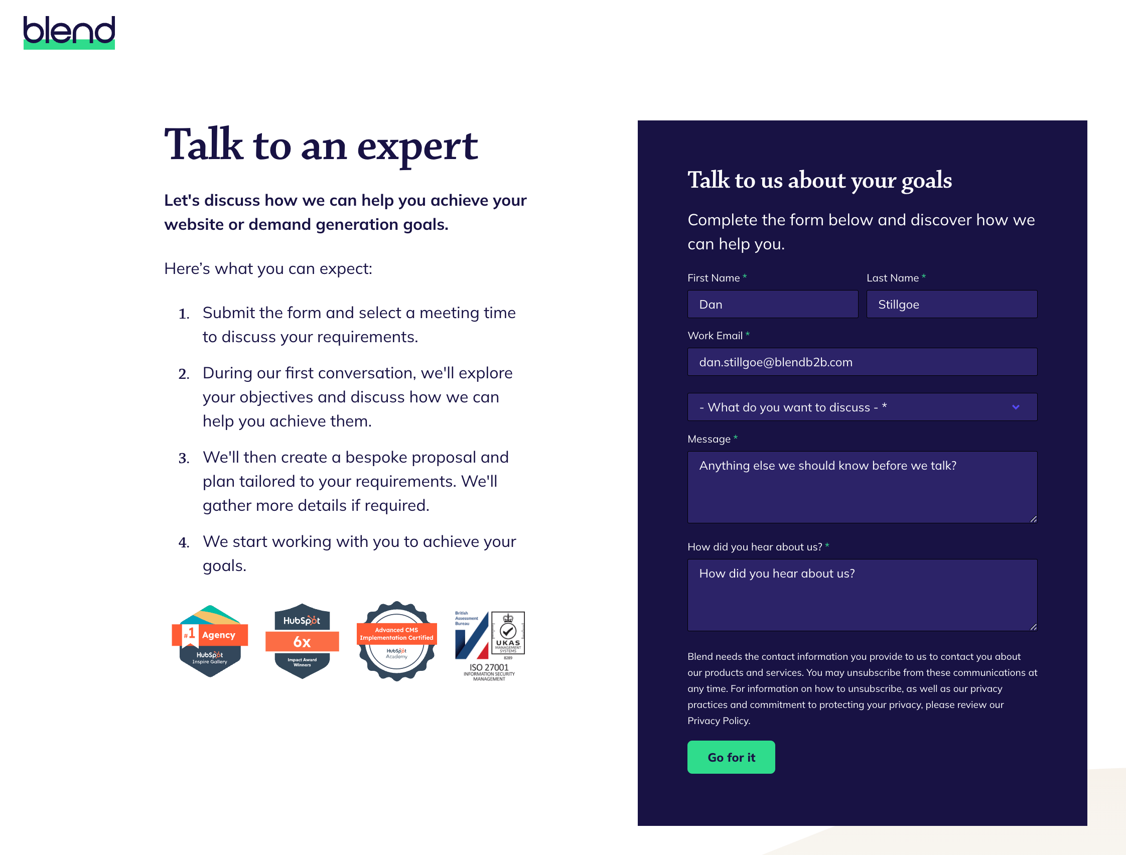
As a HubSpot website design agency, the primary goal of our website is to connect prospects with our team to discuss their requirements. We take a consultative approach to enquiries, which is reflected in the language we use "talk to an expert".
We clearly outline the process someone can expect to go through when working with us, setting expectations upfront by detailing the next steps after submitting the form. The social proof section below, displaying accreditations and recognition, positions us as a trusted partner and subject matter experts in our field, instilling confidence in prospects.
By implementing these strategies, you'll be well-equipped to improve your B2B website conversion rate. Remember, optimisation is an ongoing process. Continuously monitor your metrics, test new approaches, and refine your strategies based on the data you gather.
By focusing on what truly matters to your audience and providing clear, valuable pathways to conversion, you'll not only increase your conversion rates but also build stronger relationships with prospects from the very first interaction.