
What is HubDB and how can you use it for your website?
Mar 27, 2025
The HubSpot reporting add-on brings a much needed layer of flexibility to the platform's default dashboards.
The custom reports and dashboards you can now create with the reporting add-on can help you see, at a glance, how you are progressing in key areas across the entire marketing and sales funnel.
Often, however, the most valuable reports are not the ones you expect, or the ones used to demonstrate the add-on's capabilities.
Part of the challenge of creating a good dashboard is figuring out what reports to put on it. Starting with a blank canvas makes things even harder.
In our opinion, a useful dashboard is one that provides relevant, actionable information, in context.
To this end, we prefer reports that show the status of metrics that matter to you or your users. And, more importantly, we like to look at reports that show trends. After all, a number on its own doesn’t mean nearly as much as the historical trend.
It's also useful to structure your dashboard in a way that aligns to the way the business thinks and operates. For example, we like to organise reports in line with the marketing and sales funnel.
Depending on your preference, however, it may make sense to follow inverted pyramid principles and show the most important information, i.e. revenue related reports, first, and show the detail (i.e. traffic, MQL, opportunities) afterwards .
With all this in mind, here are 8 HubSpot reports, from the top to the bottom of the funnel, that you should add to your dashboards today to give a real and actionable insight into marketing and sales performance.
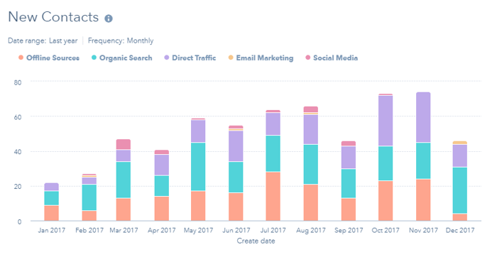
Contact generation is an important leading indicator of performance further along the funnel.
HubSpot's marketing performance report, present on the marketing dashboard by default, does provide a contacts trend line, but you can build a more informative report using the reporting add-on.
Using HubSpot's Original Source as the split metric and displaying the results on a stacked column chart gives you an instant overview of both the overall trend and which channels are the most effective.
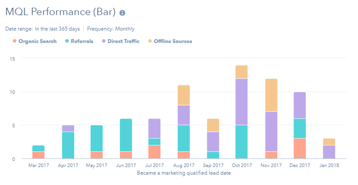
Given that the focus of many marketing initiatives is the creation of MQLs, it's a little odd that more MQL reports aren't available as standard. It's probably down to the huge variety of ways in which MQL can be defined.
With the reporting add-on though you can build useful MQL reports of your own.
The first we recommend is the MQL performance stacked column report.
Like the new contact report above, this MQL report shows the number of new MQLs created each month and the channels that originally created them.
Knowing which marketing channel is generating the most new MQLs over time is a great way to start optimising your marketing budget.
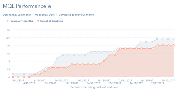
A useful way to look at MQLs is how their numbers are doing as the month progresses.
This report is similar to the contact trend line mentioned earlier, but for MQLs, and gives you a good indication if everything is on track this month or not by comparing to the previous month.
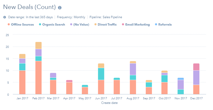
This chart shows you how many of those new contacts and MQLs are turned into opportunities each month.
By using original source as the split metric again, you see exactly which channels are contributing most to deal creation.
This report can also help you identify seasonality in your buyer's purchase behaviour, which could be very different to seasonality in contacts and MQLs, helping you to anticipate and prepare for times when more new business can be generated.
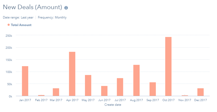
While the above report looks at the number of new deals, its useful to also look at the financial value of those deals.
Keeping an eye on the creation of new deals and their value can help you to diagnose revenue problems before they hit your bottom line.
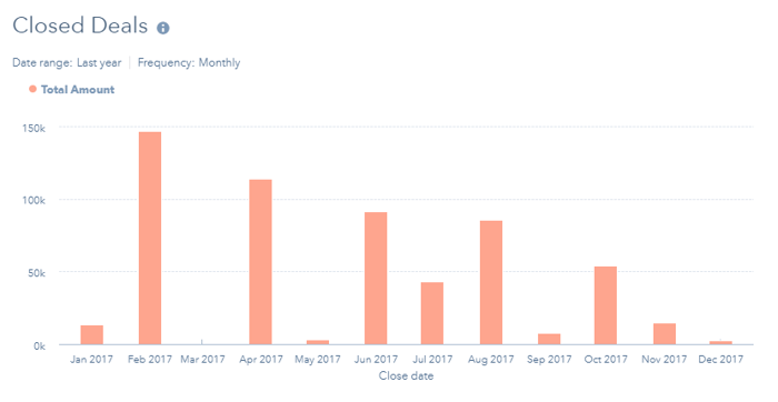
This closed deals report looks at how well all those new deals are turning into revenue.
By looking at closed won deals by close date you can see how revenue is being generated across the year.
You could then customise this report in a number of ways, i.e:
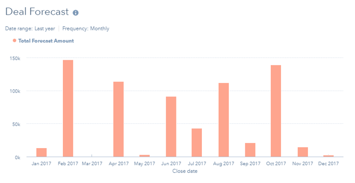
So far, we’ve looked back, at the trends that have brought us to the present day and situation.
We need to look forward too, however, at what we expect to happen in the future. The classical way doing this is to look at deal forecasts.
Looking at the forecast value (amount multiplied by probability) of deals expected to close in the coming months gives you a conservative, and hopefully realistic, outlook on future revenue creation.
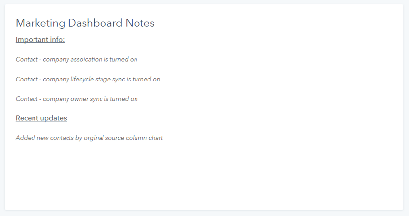
This last recommendation isn't a chart at all.
The notes widget lets you add an area of text to your dashboard and can be really useful for giving users additional insight, context and reminders regarding the dashboard reports you've added.
In particular, I use this area to remind myself and inform others about:
Even if every report is carefully selected to perform a valuable role, a dashboard can become a wall of charts that, when viewed altogether, can be overwhelming and appear non-sensical.
Some explanatory text can be a welcome break from the data and can help to ensure that users take the right information away from their dashboard visit.